Post 3 Pixel Art and why it’s so damn good 25/2/2021
If I had of tried to make Arlo by myself with a realistic art style and animation, I would’ve probably destroyed my will to live by now. Queue Pixel Art, not really an art movement, more just a limitation of technology that sprouted up around the first arcade games in the 1980s that stuck around into the present day because of its nostalgic feel, ease of use and aesthetic value.
Pixel Art meant that drawing out the world was made considerably easier (Especially for someone who hates drawing backgrounds). Here I’ll show you.

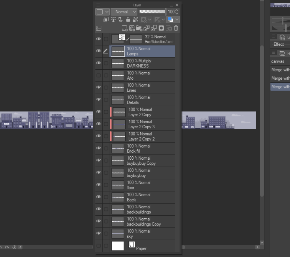
Here we see my layer set up. The stuff at the bottom of the list is behind the stuff at the top of the list (In the canvas) We can work from bottom to top so it’s easier.
- The first layer is Sky, self-explanatory, everyone knows what the sky is.
- The next two layers are back buildings, those would be the buildings off in the background, the faint ones that add more depth.
- The next layer is the back, the wall behind the buildings again added for depth.
- The floor should be self-explanatory.
- Ignore the buybuybuy copy (This was me testing to see if it would be easier if I just drew entire buildings to copy and paste) and you get brick fill. The brick fill layer is good because above it is the clipping layers that are just bricks that I filled the whole canvas with. This means that whenever I fill in a wall with the brick fill layer, instead of it being a solid colour it will fill the building with bricks, so I don’t have to painstakingly draw individual bricks when I make a new building.
- The details layer is every bit of detail you see. The windows, the posters, the banners, the bins, the air conditioning systems on top of the buildings and the doors, even the top layers of the buildings are details, and that means they can all be copied and pasted without messing up the rest of the canvas.
- The lines layer are the building positions, basically just a square that shows the outline of the building that is to be decorated.
- The Arlo layer brings up a picture of Arlo for scale, so I knew whether I was making buildings too big of small.
- The Darkness layer is a multiply layer that helped me make some of the ridges stand out more.
- The lamps are the lamps.
- And the hue/saturation/luminosity layer helps me control those three and helps to make it a bit gloomier.
Despite how I’ve set it all up to be able to put it together as quickly as possible, I’m sure some improvements to the art system could be made. For example, I have a big issue with this process in the fact it is extraordinarily dull, and without sacrificing efficiency, I have no idea how I would make the world building more enjoyable. Something to consider when drawing worlds in later games.
