
The World
Initially the game was going to be about making narrative decisions while roleplaying as a psycopath, the first idea I had was a game that showcased the futility of the “it could be worse” mindset. In the first picture below, the player approaches a cat stuck in a tree, they could either, set fire to the tree, making the cat jump out, or set fire to the cat, resulting in the fact there would no longer be a cat stuck in the tree.
I was politely recommended not to pursue the idea.
The utopia aesthetic has been a consistent pastelly pink, white and blue, to contrast the robust nature of the rest of the game, as it only shows up at the end.
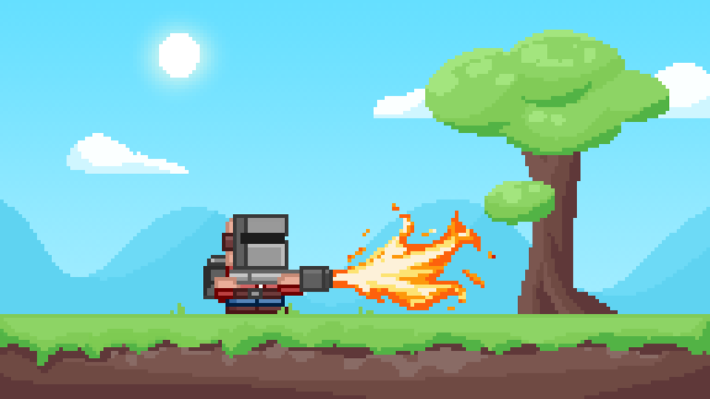

Over the course of this semester, the World/background has changed a lot. Initially, I used some placeholder graphics that I bashed out in about an hour. These are shown below.
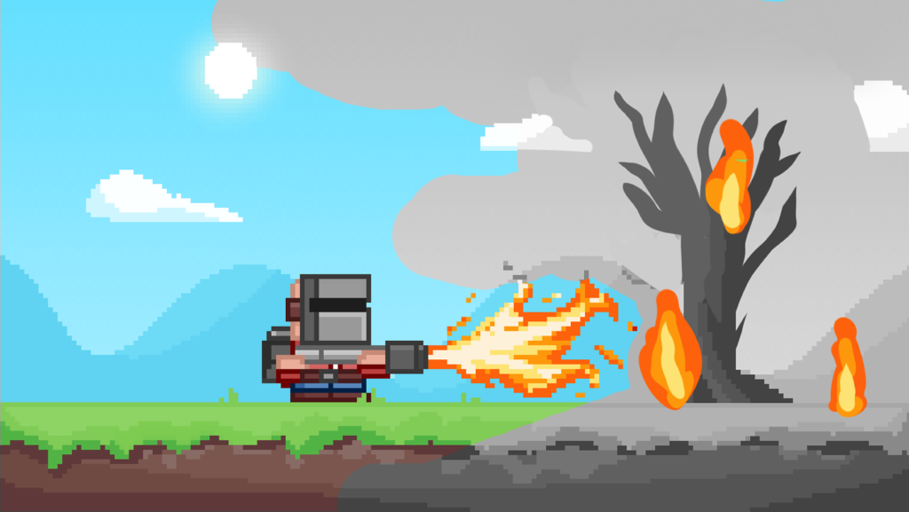
The static fire plumes were to be replaced by animated fire that would show up after deletion of the first layer to add a bit more movement to the world.
Here’s the pinterest board I set up to try and nail down a theme:
I wanted the game to have a light hearted and upbeat tone and aesthetic to contrast the rather bleak message. (i’m all about weird contrasts)
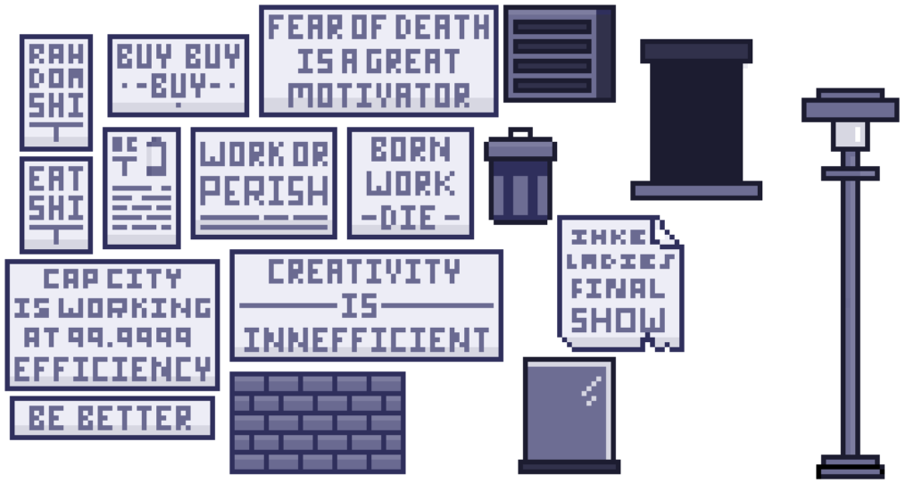
The propaganda posters were an early idea I had to spruce up Cap City but later became an integral part of the game and allowed ample opportunity for hidden messages adding a nice flavour.
My initial idea was to draw out all of the messages and import them, but I found it was actually a lot easier and more efficient to draw them directly onto the main canvas. The picture below shows the initial idea behind the detail importation, and not only includes some of the first posters but also other repeatable details like the lamp-post, doorways and roof ventilation boxes.
If I were to take Arlo forward more I would spend more time designing these little details so that they were more interesting to look at.
The final draft of Cap City was a slog, initially the world was built up to the first gap, as seen below in the Cap City strip. These first 8 buildings, I assumed incorrectly, would be enough for a reasonable amount of play time. When I play tested with just that section I realised the game would need a lot more meat if it was going to be fun.
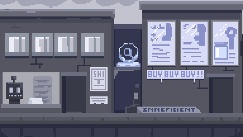
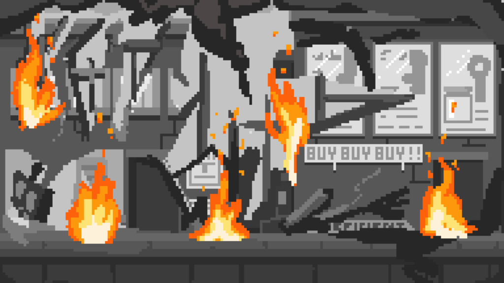
Throughout Art dev the colour pallet has stayed pretty much the same. Cap City has remained blue and grey to push the idea that it is a sad and boring place, the Ashen wasteland has remained dark grey and black to resemble “the dark times” and also things tend to get a bit darker when you set them on fire, and the pink Utopia has remained with its pastel blue and pink tones, a nice end to a weird game.


Arlo and the Flamethrower
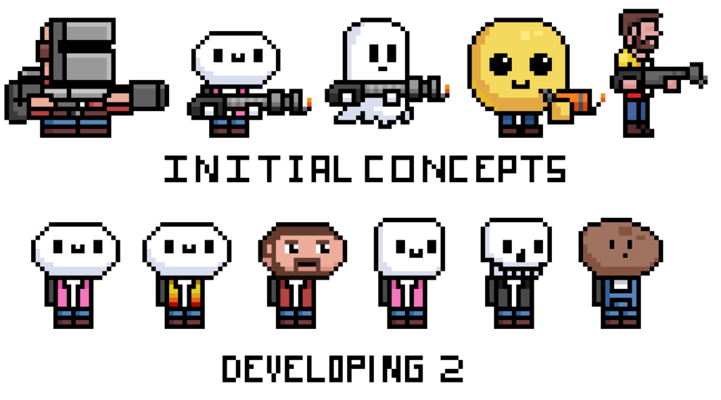
I decided that my initial idea for my character was a bit too edgy and not nearly cute enough. The metal mask made it hard for players to relate to them. I then tried to push it more towards a rounder friendlier shape and showed my new concepts around to get opinions. I then decided based somewhat off of those opinions that I would take the second design forward, and after developing it even more decided I liked it enough to just carry it forward into the game.
Animating Arlo was then very simple. It involved separating his legs from his body and yeeting them around a bit.
Flamethrower Dev
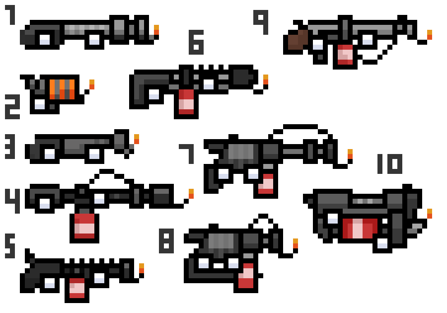
I spent a bit more time on the Flamethrower. I couldn’t decide if I wanted something more futuristic or just something more simple. The main issue I ran into was pixel size, how I was going to create an interesting weapon with such restrictions. As you can see above, I drew out ten weapons and put the wall on Twitter to try and get some opinions.
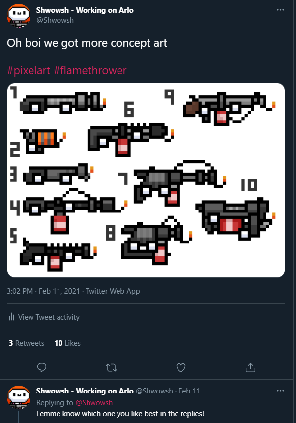
I didn’t get many opinions, but that’s okay, I’ve found Twitter takes as much commitment as actually making the game, which is probably why games companies hire community managers and such.
I really liked number 10 but regrettably, it turned out the design was way too big for Arlo. I was also a fan of number 4, but it was a bit too long.
I ended up selecting number 6 to take forward. it was the chunkiest version that didn’t overwhelm the character design, so I think it worked well.